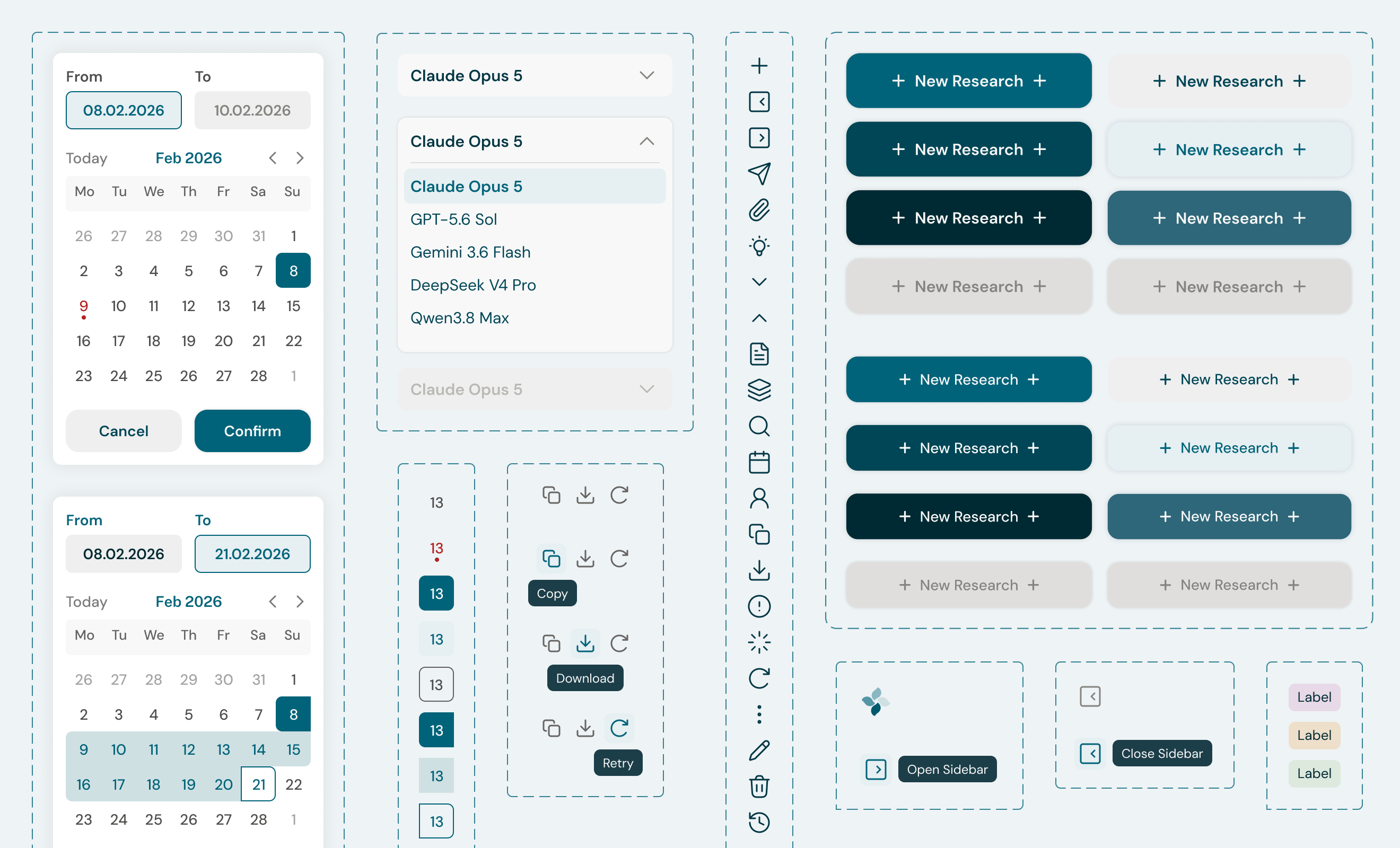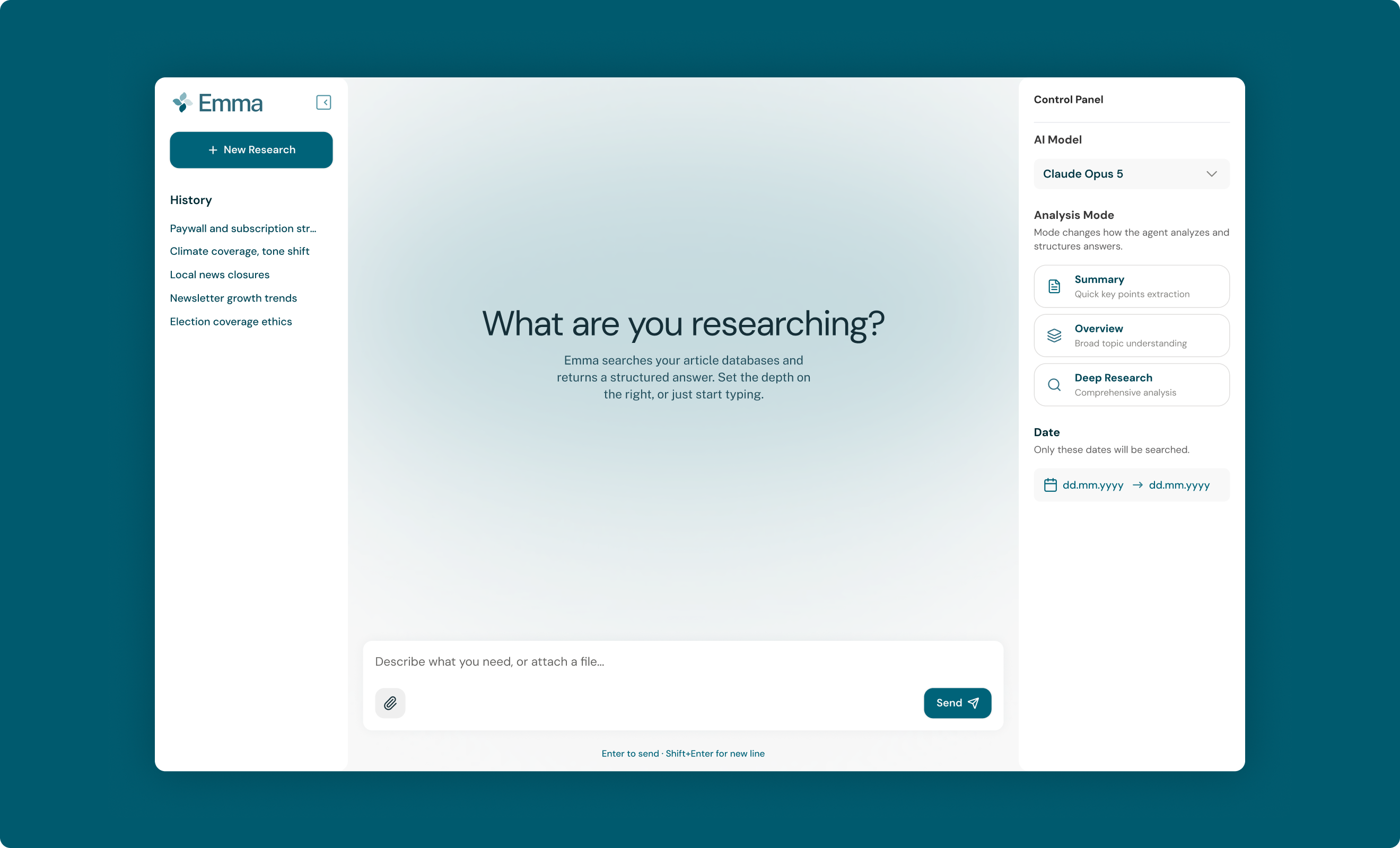

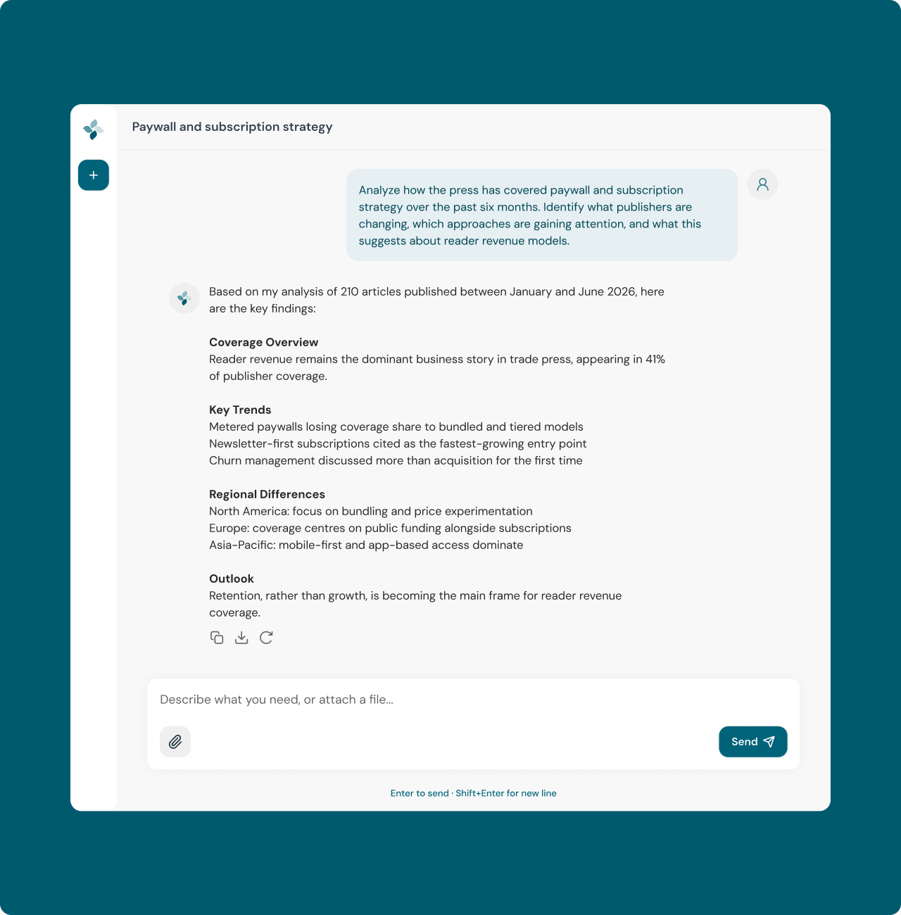
The agent needed to work at three different depths, from a quick summary to a full research pass. Two rules were fixed by the system itself: date filtering had to be exact rather than interpreted by the AI, and the AI model was chosen automatically based on the selected mode. Both rules had to be visible in the interface instead of hidden behind it.
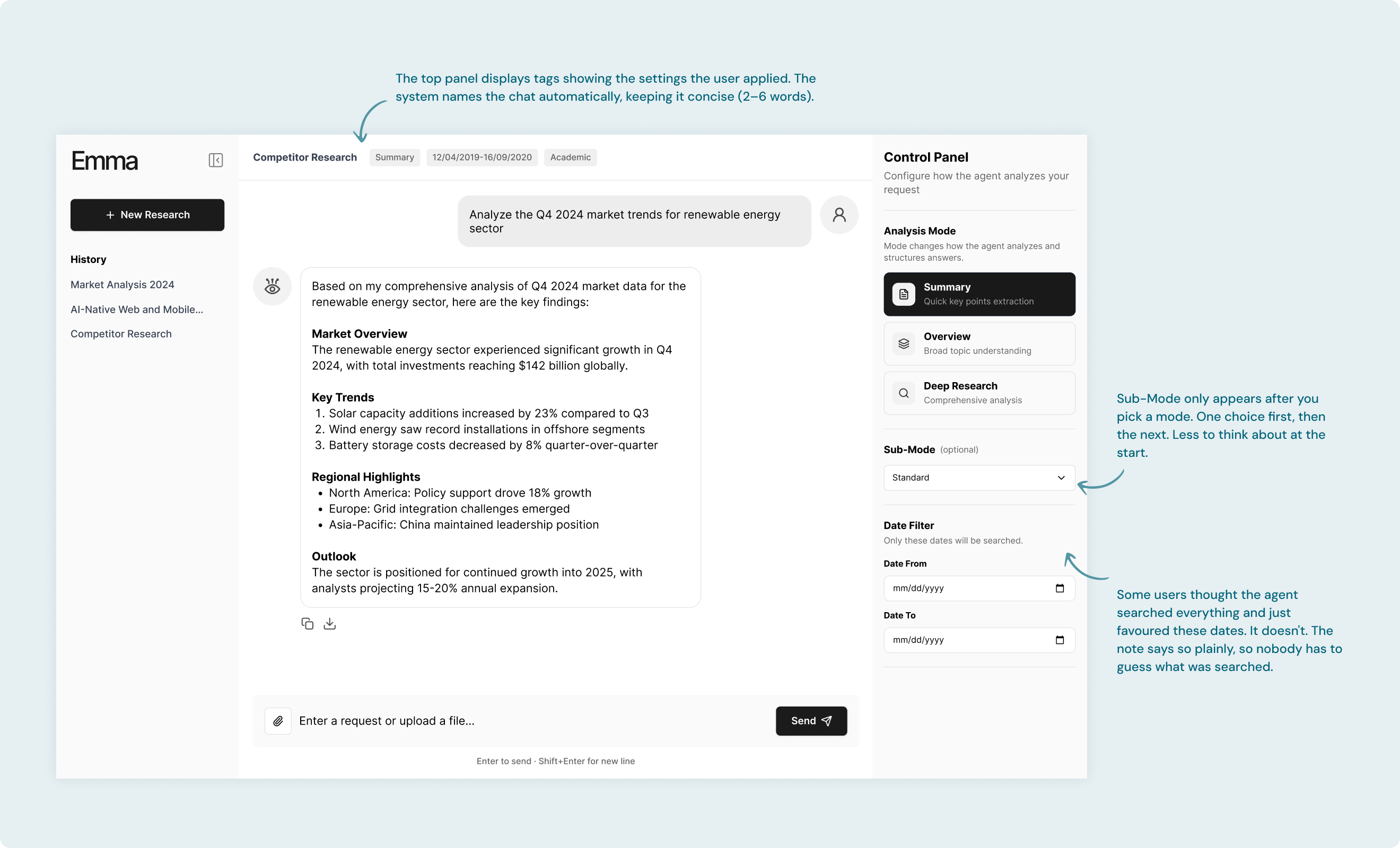
Most of my decisions on this project came from a single question: when the system behaves in a way the user did not choose, how do I make that legible instead of confusing? My process included:
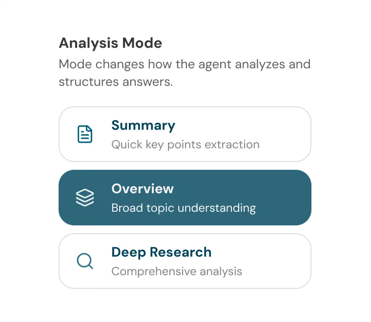
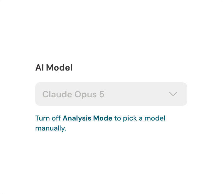

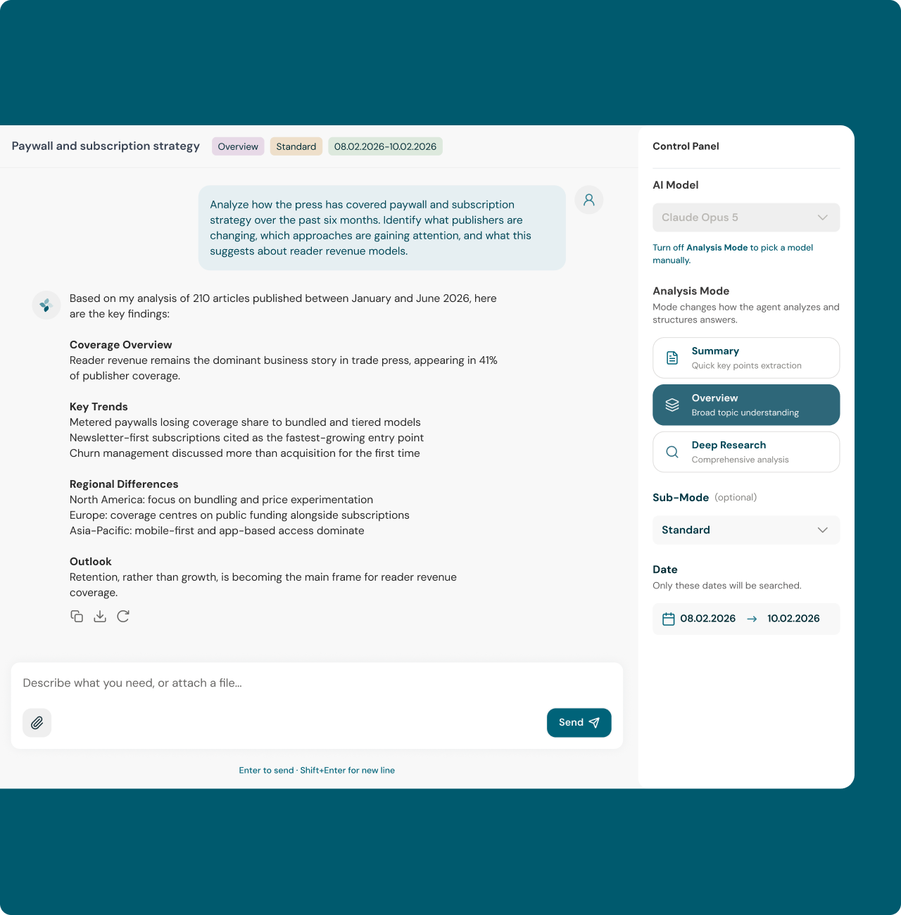
I designed Emma from scratch and delivered the full scope: research, user flows, wireframes, the complete UI, and the component kit the product shipped with. The wireframes and final UI were approved on the first iteration. They matched the technical brief and also covered the UX logic that was not defined in it, like what the interface does when a mode locks the model, or when a search runs with no filters set.
The developers implemented the design from my handoff, and analysts were working with the MVP two to three weeks later. It gave them a faster way to move through large volumes of articles, control how deep each analysis goes, and reuse the output directly in their own work.